
7 Best Ways to Optimize Your Shopify Thank You Page for Maximum Revenue (2025-2026 Guide)
Your thank you page converts at 10-15%. Your ads don't. Learn 7 strategies to optimize your Shopify thank you page for maximum AOV.

What happens on your Shopify thank you page after a customer completes a purchase? For most stores, the answer is: nothing. It’s a digital dead end, a polite nod before the customer closes the tab. This is the single most expensive mistake you might be making in your e-commerce business. Effective Shopify thank you page optimization is not about being polite; it's about being profitable.
Your thank you page is the only page every single one of your customers sees, yet it remains the most underutilized asset in the entire Shopify ecosystem. A store with $100,000 in monthly revenue that ignores this page is leaving an estimated $10,000 to $15,000 in additional revenue on the table every single month. That's up to $180,000 per year in lost profit that could be captured with a few simple changes.
This isn't just theory. Based on data from over 1,500 Shopify stores using Cart-X, we've found that a well-optimized thank you page can become your highest-converting sales channel. In this guide, we will break down 7 proven, data-backed strategies to transform your static thank you page from a dead end into a powerful revenue machine. We'll show you how to leverage the peak buying state of your customers to significantly increase your Average Order Value (AOV) and Customer Lifetime Value (LTV); without spending a single extra dollar on ads.
Why Your Shopify Thank You Page is a Conversion Goldmine (Not an Afterthought)
It’s easy to think of the thank you page as the end of the road. The customer bought something, you said thanks; job done, right? But that’s looking at it all wrong. The thank you page isn’t the end; it’s the real beginning of your relationship with that customer.
It's the only page on your site with a 100% open rate from people who have just proven they trust you with their money. They are in a state of "peak trust" and are most receptive to what you have to say. Ignoring this moment is like a band walking off stage without playing an encore for a cheering crowd.
The Data: Where Conversions Actually Happen
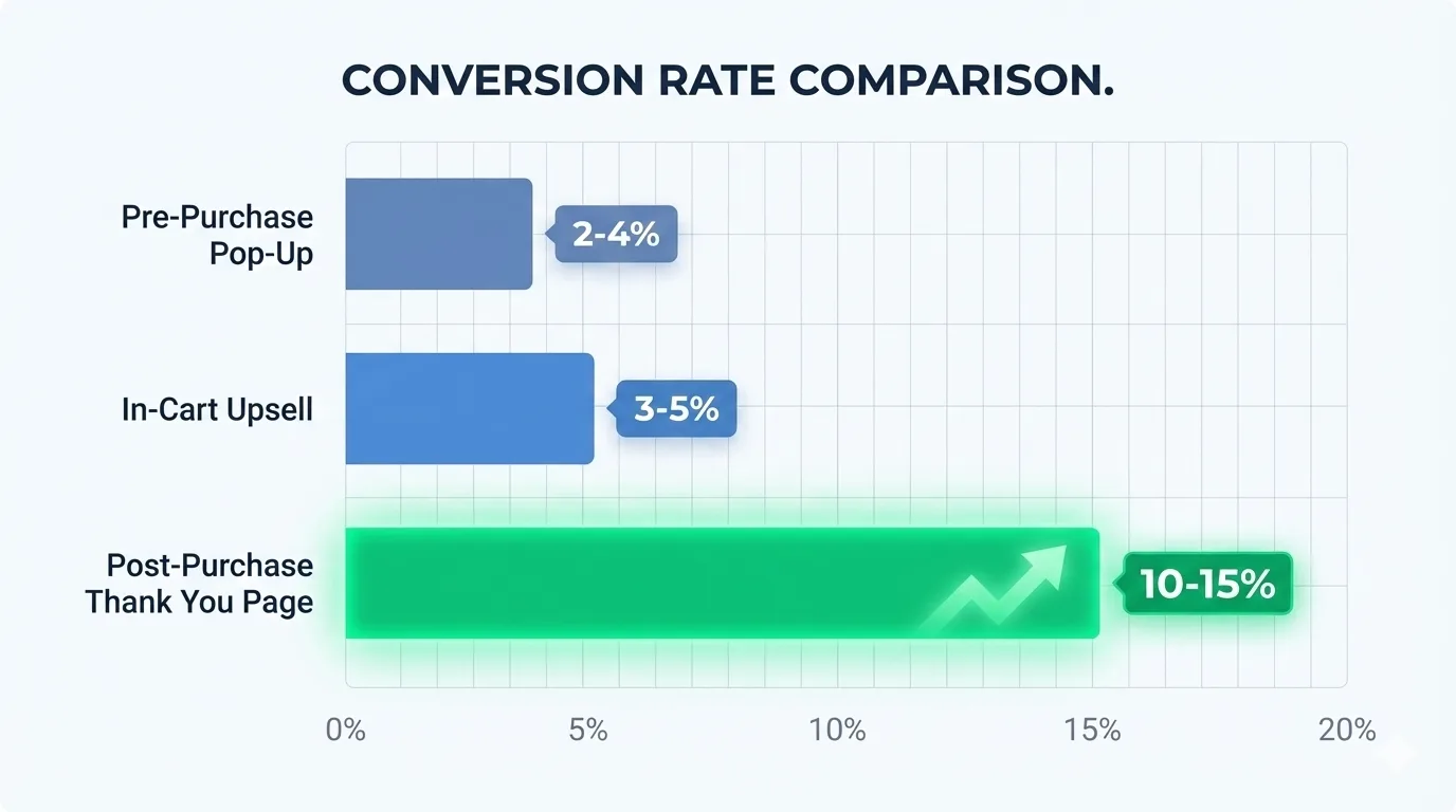
Let's look at the numbers. We spend so much time and money trying to optimize product pages and checkout flows, but the data tells a surprising story. When we analyzed conversion rates across thousands of Shopify stores, the thank you page emerged as the undisputed champion for impulse additions.
A 10-15% conversion rate is unheard of on any other page. Your customers are literally telling you they are ready and willing to buy more, but only if you make it easy for them.
Quantifying the Opportunity: The Real Cost of a "Dead End" Page
So, what does this all mean for your bottom line? Let's put it in simple terms.
If your store is doing $100,000 in revenue per month and you're not optimizing your thank you page, you are likely leaving $10,000 to $15,000 in additional revenue on the table. Every. Single. Month. That’s up to $180,000 a year in pure profit that you could be capturing just by making a few simple changes to a page you already have.
It’s not about spending more on ads or finding new customers. It’s about making the most of the customers you’ve already earned. By treating your thank you page as just a confirmation, you are closing the door on your most profitable conversation.
The 5 Essential Elements of a High-Converting Shopify Thank You Page
Most merchants treat the thank you page as an afterthought. A quick confirmation message, maybe an order number, and that's it. But the stores that consistently outperform their competitors understand something different. This page isn't the end of the transaction. It's the beginning of your most profitable customer interaction.
Before getting into specific tactics, let's cover the foundation. A thank you page that actually converts isn't a random collection of widgets thrown together. It's a carefully structured experience where every element earns its place. Think of these five components as your blueprint.
1. Start With a Crystal-Clear Order Confirmation
This sounds obvious, but you'd be surprised how many stores get it wrong. The very first thing your customer needs to see is proof that their order went through. A bold thank you message with their name. The order number displayed prominently. A quick summary of what they just bought.
Why does this matter so much? Because the moment after checkout is filled with quiet anxiety. Did it work? Did they charge me twice? Will this actually show up? A clear confirmation calms those nerves instantly. It builds trust right when you need it most. Don't make customers hunt for this information or scroll past other content to find it. Put it front and center.
2. Focus on One Powerful Call-to-Action
Here's where most stores completely fall apart. They cram the page with a dozen different tasks. Follow us on Instagram. Read our blog. Join our newsletter. Check out these other products. Share with a friend.
Too many options create confusion. And a confused mind always defaults to doing nothing.
Your thank you page should have one primary goal. One thing you want customers to do more than anything else. For maximum revenue impact, that goal should be your post-purchase upsell offer. Everything else is noise that pulls attention away from the action that actually grows your business.
3. Add Reassurance and Social Proof
Your customer just handed over their credit card information. They made a decision. Now a small part of their brain is wondering if they made the right one.
This is exactly where social proof works its magic. A short testimonial from a happy customer. A line like "Join 50,000+ customers who love their purchase." Logos from publications that have featured your brand. These elements don't need to dominate the page. They just need to be present, quietly reinforcing that the customer made a smart choice.
The goal is validation. You want them nodding along, feeling good about what they just did. That positive emotional state makes them far more receptive to whatever you offer next.
4. Include a Personal Touch
Nobody wants to feel like they just bought from a faceless machine. A little personality transforms the entire experience.
This could be a short video message from the founder saying thanks. It could be a fun image or GIF that matches your brand's vibe. Even a simple heartfelt message works, something that shows real humans exist behind the website. The specific format matters less than the authenticity behind it.
According to Ryan Muhammed in one of his LinkedIn posts: "People don't buy from brands. They buy from people who happen to have brands."
Your thank you page is a perfect opportunity to remind customers there are actual humans who appreciate their business. That emotional connection turns a one-time buyer into someone who comes back.
5. Give Customers a Clear Path Forward
Finally, tell them what happens next. This sounds small but it prevents a surprising amount of confusion and support tickets.
Let customers know when they'll receive a shipping confirmation email. Give them a realistic delivery window. Include a link to track their order once it ships. These details manage expectations and reduce the anxiety that comes with waiting for a package.
When you nail all five of these elements, your thank you page stops being a dead end. It becomes a launchpad for your most profitable offers.
The 7 Best Thank You Page Optimization Strategies (Prioritized by ROI)
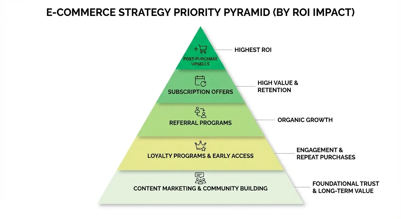
Now let's talk tactics. Not all thank you page strategies deliver equal results. Some move the needle dramatically. Others barely register.
We analyzed data from over 1,500 Shopify stores to rank these seven strategies by their actual impact on revenue. If you're not sure where to start, follow this list from top to bottom. And if you only have time for one thing, make it the first one.
1. Add a One-Click Post-Purchase Upsell
This is the single most profitable thing you can do with your thank you page. Nothing else comes close.
A post-purchase upsell appears after the customer pays but before they leave your store. Because their payment information is already on file, they can accept the offer with one tap. No checkout forms. No re-entering credit card numbers. Just a single click and the product gets added to their existing order.
This frictionless experience is why post-purchase upsells convert at 10-15%, dramatically higher than any other offer type. Cart-X data shows merchants typically see a 15-25% increase in average order value from this strategy alone. If you implement nothing else from this article, implement this.
2. Offer a Subscription Option
For stores selling consumable products like coffee, supplements, skincare, or pet food, this strategy is a goldmine. The thank you page catches customers at peak excitement about their purchase. They're already thinking about using the product. Offering a convenient subscription at this moment feels helpful rather than pushy.
The AOV impact is modest at around 5-10%. But the lifetime value increase can be massive, anywhere from 50-150% depending on your product and pricing. You're turning a single transaction into predictable recurring revenue. That changes the entire economics of your business.
3. Launch a Referral Program
New customers are often your most enthusiastic advocates. They just discovered something they're excited about, and that excitement is contagious. Why not channel it into growth?
The thank you page is a natural place to introduce your referral program. Offer a compelling incentive like "Give $10, Get $10" and make sharing effortless. One click to copy a link or share directly to social media.
The direct AOV impact is small at 1-3%. But the customer acquisition benefit compounds over time. You're essentially turning happy customers into a low-cost marketing channel.
4. Display Social Proof and User-Generated Content
Help customers feel great about what they just bought by showing them others love it too. This could be a feed of Instagram photos from real customers using your products. A few powerful testimonials. Star ratings from verified purchasers.
The revenue impact here is indirect. You won't see an immediate AOV bump. But you're reinforcing their decision and reducing the chance of returns or buyer's remorse. Over time, this builds toward a 5-10% increase in lifetime value through better retention.
5. Collect Feedback With a Simple Survey
Want to understand your customers better? Ask them directly when their purchase is fresh in their minds.
A single question works best. "What almost stopped you from buying today?" or "What are you most excited to try?" The answers give you insight that no analytics tool can provide. You'll learn objections to address in your marketing, features to highlight, and language that resonates with real buyers.
There's no immediate revenue impact. But the data you collect improves everything else you do.
6. Add a Personalized Video Message
A short video from the founder or team thanking customers for their order stands out in a sea of automated confirmations. It doesn't need to be polished or professional. In fact, a casual, genuine message often performs better than something overly produced.
This won't directly increase order value. But it builds brand loyalty that pays off over months and years. Customers who feel a personal connection return more often and spend more when they do.
7. Encourage Social Media Follows
This is the lowest-impact strategy on the list. Growing your social following has value, but it shouldn't come at the expense of higher-ROI tactics.
If you want to include social links on your thank you page, keep them subtle. A small section at the bottom works fine. Just make sure they don't distract from your primary call-to-action. An Instagram follow is worth far less than a post-purchase upsell acceptance.
The data is clear. Post-purchase upsells deliver the highest immediate ROI. Subscriptions drive the biggest long-term value increases. Everything else is worth considering once you've nailed those two foundations.
How to A/B Test Your Thank You Page Offers for Continuous Improvement
Getting your first upsell live is a big deal. Celebrate that win. But don't make the mistake of thinking the work is done.
The merchants who consistently outperform their competitors share one habit. They never stop testing. The offer that converts well today might get crushed by a better idea next month. That’s because customer preferences shift, seasons change and new products enter your catalog. What worked in Q1 might underperform in Q4.
The good news is you don't have to guess what resonates best with your audience. You can let your customers tell you directly through their behavior. That's exactly what A/B testing does.
The concept sounds technical but it's actually simple. You show one version of your offer to half your customers. Call it Version A. The other half sees a different version. Call it Version B. Then you compare which one generates more revenue. Whichever wins becomes your new default, and you start testing something else against it.
The fact is, an optimization based on mere opinions is just expensive guessing. Data-based optimization is how you actually grow.
That mindset separates stores that plateau from stores that compound growth month after month.
What to Test First
You can technically test anything on your thank you page. Button colors. Font sizes. Image placement. But starting with minor tweaks is a mistake. Small changes produce small results, and you'll waste weeks learning almost nothing.
Focus on the variables that actually move the needle.
The offer itself matters most. Try testing two completely different products against each other. If you run a coffee store, pit your best-selling blend against a new single-origin option. You might assume customers want the familiar choice, but the data could surprise you. Sometimes the unexpected product wins by a wide margin.
The discount percentage comes second. Price is a powerful motivator, but more discount doesn't always mean more profit. Test 20% off against 30% off and see what happens. Or try a percentage discount versus a flat dollar amount. "Save 20%" hits differently than "Save $10" even when the math is identical. The goal isn't maximum conversions. It's maximum profit after accounting for the discount you're giving away.
The headline and copy round out the big three. Words shape perception. Test a headline built around scarcity like "Limited Time Offer" against one focused on value like "Our Best-Seller at 30% Off." Try short punchy copy versus longer explanations. A few different words can swing conversion rates dramatically in either direction.
Once you've optimized these major variables, then you can move on to smaller details like button colors and layout tweaks. But start with the big stuff first.
Reading the Results the Right Way
Your test has been running for a week or two. Data is coming in. The temptation is to look at conversion rates, pick the higher number, and declare a winner. That's a mistake rookies make constantly.
Conversion rate tells you what percentage of customers said yes. But it doesn't tell you how much money you actually made. And those two things don't always align.
Here's what you need to examine together. First, look at the conversion rate to understand how persuasive each offer was. Second, check the average order value contribution to see how much each accepted offer added to the total purchase. Third, and most importantly, calculate total revenue generated by each version.
Sometimes a lower-converting offer on a more expensive product generates more profit than a higher-converting offer on a cheaper one. A 5% conversion rate on a $40 upsell beats a 10% conversion rate on a $15 upsell every single time. You have to look at the complete picture, not just one metric in isolation.
Making This Easy With Built-In Analytics
Running A/B tests manually is tedious. You'd need spreadsheets, careful tracking, statistical significance calculations, and constant monitoring. Most merchants don't have time for that, and small errors can lead to wrong conclusions.
Cart-X handles all of this automatically. When you set up a test inside the dashboard, the analytics track everything in real time. You get a side-by-side comparison showing conversion rates, AOV impact, and total revenue for each version. No formulas. No guesswork.
The dashboard highlights which version is winning so you can make confident decisions. When you have enough data to declare a winner, turn off the losing version and send all traffic to the one that makes more money. Then start your next test.
This cycle of testing and improving never really ends. Each small win compounds on the last one. A 10% improvement this month plus another 10% next month doesn't give you 20% total. It gives you 21%. And those gains keep stacking over time.
The stores that commit to continuous testing don't just optimize their thank you pages. They build systems that get better automatically while competitors stay stuck with whatever they launched on day one.
Your Thank You Page Is a Beginning, Not an End
Every customer who completes checkout lands on your thank you page. That's 100% of your buyers giving you their attention at the exact moment when trust is highest and buying momentum is strongest.
Most stores waste this completely. A generic confirmation message, an order number, and nothing else. The customer closes the tab and the opportunity disappears.
Post-purchase upsells convert at 10-15%. That crushes email campaigns and paid ads. Your thank you page can outperform almost every other marketing channel you have, and it costs nothing extra to reach those customers.
The setup doesn't require developers or weeks of work either. Cart-X can have your first upsell live in under five minutes.
Your customers already said yes once. Give them the chance to say yes again.
Ready to turn your thank you page into a revenue machine? Start your free 30-day Cart-X trial today.
Don't miss out on expert e-commerce and marketing insights! Subscribe to our newsletter for valuable tips in just a few clicks.

.svg)


