
Mobile-First Upsells: Capturing 79% of Shopify Traffic in 2026
79% of Shopify traffic is mobile. But mobile AOV lags behind desktop. Here's how to close the gap with thumb-optimized, native upsells.
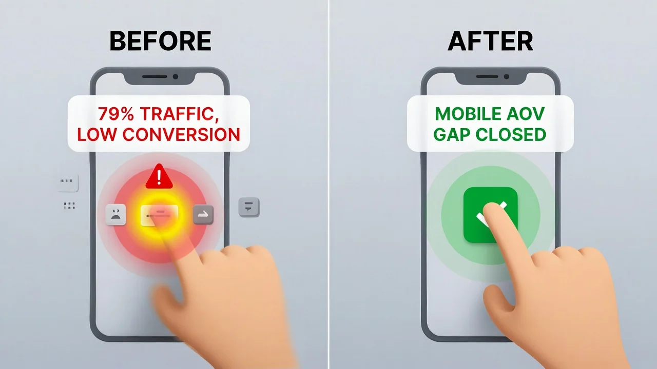
Data published in January 2026 shows that 79% of all Shopify traffic comes from mobile devices. For many merchants, this figure represents a painful discrepancy. While mobile brings the bulk of visitors, it seriously lags behind in revenue.
Desktop traffic consistently outperforms mobile traffic in terms of conversion and Average Order Value ( AOV). The average desktop conversion rate is 1.4% vs. 1.2% for mobile (14% decrease). For AOV, the numbers are $95 and $40 respectively. This is known as the Mobile AOV Gap.
This performance gap directly translates to lost revenue, and closing it requires strategic thinking. You'll need to adopt a mobile-first approach that addresses the preferences, constraints, and psychological triggers of mobile shoppers.
Keep reading until the end to find out how you can increase AOV for mobile visitors without negatively impacting conversion.
The Mobile AOV Gap Crisis
Mobile users tend to spend much less than their desktop counterparts. And it’s usually because the checkout experience is fundamentally broken for the way people use their phones or behave on the go.
Let's paint a typical real life experience of a mobile shopper. They're standing in line at a coffee shop, thumb-scrolling through Instagram when an ad catches their eye. They tap on the ad and land on a Shopify store. Then the problems start; every click seems to take forever to load, and they have to pinch to zoom in to clearly see products or read descriptions.
They finally make it to checkout and are met with a maze of tiny form fields that they have to battle auto-correct to fill. By the time they've fat-fingered their credit card number for the third time, their order is being called and the purchase is abandoned.
The few that manage to make it past checkout and actually order face another unique challenge when merchants use legacy apps for post purchase upsells. These legacy apps completely destroy the experience because they rely on clunky pop up and redirect scripts loaded from third-party servers. This is one reason post-purchase upsells outperform pre-purchase offers on mobile.
To make a bad situation worse, privacy-first browsers like Firefox can automatically block these scripts. Given that privacy browsers are used mostly on mobile devices and 79% of Shopify traffic comes from mobile users, it's safe to say that many visitors won't even see the upsell offer.
These factors combined are what we call the Friction Tax. Every unnecessary tap, zoom-to-read moment, and tiny form field that triggers the keyboard to cover half the screen is a tax on the user’s patience and willingness to complete the transaction. Implementing good thumb-zone philosophy is one of the ways to reduce this friction.
The Thumb-Zone Philosophy: Designing for Zero-Friction
On a mobile device, every millimeter of screen real estate is a battleground. If your upsell requires a customer to zoom, scroll, or re-enter their credit card information, the sale is already lost.
In 2026, high-performing stores are moving toward the Thumb-Zone Philosophy. This means placing your primary call-to-action (CTA) within the natural arc of a user's thumb.
Shopify apps like Cart-X do this exceptionally well by utilizing Shopify Native UI Extensions. Cart-X ensures that your "Add to Order" buttons are perfectly sized and positioned, preventing fat-finger errors and accidental skips.
The Science of Thumb Ergonomics
Mobile UX researchers have come up with what they call the thumb heat map. It's a visual representation of where smartphone users can comfortably reach on their screens without having to adjust their grip.
Smartphone users usually hold their phones with one hand, navigating primarily with their thumb. The comfortable reach zone covers roughly 40% of most smartphone screens.

From the image, there are three distinct zones on every mobile screen:
The Green Zone: This is prime thumb territory. Users can reach this area comfortably with no hand adjustments and tap repeatedly without fatigue. Your primary CTA or “Add to order” button must be placed here. It’s non-negotiable.
The Yellow Zone: It's reachable but requires slight hand repositioning. You can place secondary action buttons like “View Product Details” in this area.
The Red Zone: To reach this area requires significant hand repositioning or two-handed operation. There should be no buttons in this area. It's usually used to display the product image or specifications.
How to Implement Thumb Zone Optimization
Implementing thumb zone optimization on your Shopify store is a proven strategy that can increase both conversions and AOV. Here's what works in 2026:
Full-Width CTAs: Your primary CTA button should cover at least 90% of the screen width. This makes it easy to tap and impossible to miss. Aim for a minimum dimension of 44x44px. It's also important that you use native Shopify fonts to avoid visual jarring.
Bottom-Anchored Positioning: Anchor your CTA to the lower part of the screen that's in the green zone. This ensures that it remains easily accessible as users scroll through product details.
Progressive Disclosure: Product information, reviews and FAQs should ideally be placed in tabs above the fold; the yellow zone is perfect for this. The green zone should be exclusively reserved for an anchored primary CTA. Don't force users to wade through paragraphs to reach the “Yes" button.
One screen, One Action: Each screen should require exactly one tap in the green or in the worst case scenario, yellow zone to proceed. If your checkout or upsell flow requires scrolling to read details and then scrolling back up to find the CTA, you've already introduced too much friction.
The thumb-zone philosophy extends beyond button placement. Other critical elements that require optimization are:
- Typography: Text should be readable without having to zoom (minimum of 16px for body text and 20px for headlines).
- Images: Every product image must be optimized for mobile viewing.
- Form fields: Use the right code to trigger the appropriate mobile keyboard for each field. Avoid using it entirely in post-purchase flows.
Why Native Architecture is the Only Mobile Strategy
In the 2026 Shopify ecosystem, legacy apps that rely on external script injections are facing a Mobile Death Spiral. Why?
Pop-Up Fatigue: Legacy apps don't integrate natively into the checkout flow, so they rely heavily on pop-ups. And that's the problem. Mobile users have been mentally conditioned to dismiss pop-ups instantly. This is due to years of intrusive advertising and aggressive email capture forms.
Interaction To Next Paint (INP): Heavy third-party scripts slow down the mobile browser's response time. As we highlighted in our guide on The Dopamine Window, a delay of even 200 milliseconds (200ms) can trigger System 2 logical thinking, causing the customer to question the purchase and possibly abandon the cart.
Cart-X bypasses these issues. It's a native upsell app that’s built into Shopify’s own rendering pipeline, so it stays well under the 200ms INP threshold, ensuring that whenever you run a Mobile Performance Audit, the results always return green scores.
Also, because the upsell offer is rendered as first-party code in the checkout flow, it's immune to tracking prevention and ad blockers. This means that your upsells get seen every single time.
Tactic Spotlight: The One-Tap Micro-Decision

The most successful mobile upsells in 2026 aren't complex product bundles; they are micro-decisions. These are offers that require almost zero cognitive load to accept. Perfect examples are:
- Shipping Protection: An easy $2-$5 add-on with a clear value proposition. It should read something like: “Protect your order from loss or damage for just $2.”
- Priority Fulfillment: An upsell offer like “Upgrade to 2-day shipping for $7.99” is perfect for the impatient mobile shopper who just ordered and wants it delivered yesterday.
- One-Size-Fits-All Accessories: Items like cleaning kits, charging cables or mystery rewards that don't require the user to select a size or color.
The reason micro-decisions work so well for mobile shoppers is because every decision requires mental energy. So, when you do the thinking for your customers and take away that stress, accepting the upsell offer becomes a question of yes or no.
By leveraging Shop Pay’s one-tap integration, Cart-X allows one-click upsell items to be added to the order without the user ever leaving the post-purchase page. If the initial offer is declined, our system uses Dynamic Downsell Funnels to present a lower-cost alternative, capturing revenue that would otherwise be lost.
Other Strategies That Can Boost AOV
Product Bundles: Create carefully curated bundles with complementary products. For example if you run a fitness clothing store, you can create a discounted bundle with a performance tech tee, training shorts and a pack of matching socks. Customers get better value and spend more money as a result.
Free Shipping Progress Bar: Prominently display a progress bar that shows how much customers need to spend to qualify for free shipping. This naturally encourages people to spend more. To make this strategy even more effective, you can combine it with a pop-up that's triggered when customers try to check out without reaching the free shipping order value.
Tiered discounts: Reward higher spending with bigger savings: $100 unlocks a 10% discount, $200 unlocks a 20% discount, and so on. This tactic psychologically nudges customers to reach the next tier to enjoy better discounts.
Volume-based discounts: This is similar to tiered discounts. The only difference is that you're rewarding purchase volume and not amount spent: “Buy a pack of 3 and save 15%.” Volume based discounts focus on increasing quantity per order instead of trying to push extra products.
Premium positioning: Display higher priced items near standard and basic options. Seeing a more affordable option of a premium item makes the price seem like a steal. Shoppers will typically go for the mid-tier option because it feels like the smart balance of value and quality.
Case Study: How Flex Moves Bridged the Gap
Flex Moves is a thriving Shopify store with a healthy revenue stream. They were making sales, but at the same time they knew they were also leaving money on the table by not capitalizing on upsells to pitch new products to customers.
Cart-X helped Flex Moves build a mobile-first, native upsell strategy for getting the new products in front of their target audience.
This upsell strategy led to a transformative shift in analytics data. AOV grew rapidly and they achieved a 92.5% conversion rate on their primary post-purchase offer and generated over $10,000 in revenue with an average upsell of $15.50.
You can read the full breakdown of their strategy in the Flex Moves One-Click Success Story.
Summary: The 2026 Mobile Checklist
To capture your share of the 79% mobile traffic, ensure your store meets these three criteria:
Native-Only: Ditch script-heavy apps that slow down your INP. If your upsell app loads via external JavaScript injection, it's already obsolete. Migrate to apps built on Shopify’s Native UI Extensions before Q3 2026 which is the final deadline for checkout.liquid deprecation.
One-Tap Ready: Use Shop Pay-compatible extensions to eliminate data entry from the checkout flow. Payment re-entry is an instant conversion killer for mobile shoppers who tend to drop off at the slightest inconvenience.
Thumb-Optimized: Place your offers in the Natural Arc of the screen. Your primary CTA should also be anchored in place so that regardless of whether a user scrolls through product details or not, it's always there when they need it.
Cart-X is built for mobile-first upsells. Native architecture. Thumb-optimized design. One-tap checkout.
Start your 30-day free Cart-X trial today and close the mobile AOV gap.
Mobile Upsell FAQs
Why is mobile AOV lower than desktop?
Friction. Small screens, tiny buttons, and slow-loading scripts make buying harder. Desktop AOV averages $95. Mobile sits at $40. Native apps with thumb-friendly design close that gap by making the second purchase effortless.
Do ad blockers affect mobile upsells?
Yes. Safari and Firefox block third-party scripts by default. Legacy upsell apps often never appear for these users. Cart-X runs as first-party code inside Shopify's checkout, so it's visible to everyone.
What is the Thumb Zone?
The area you can reach while holding your phone one-handed. The bottom third of the screen (green zone) is easiest to tap. That's where your "Add to Order" button belongs. Top corners require hand repositioning and kill momentum.
What sells best on mobile?
Simple offers under 25% of cart value. Mobile shoppers are distracted and impatient. They want no-brainer adds like shipping protection or priority fulfillment. Anything requiring size or color selection loses them.
How fast should upsells load?
Under 200 milliseconds. Slower than that, the brain shifts from "yes mode" to "wait, let me think." Native extensions hit this threshold easily. Legacy apps loading external scripts often don't.
Does Cart-X work with Shop Pay?
Yes. Cart-X integrates with Shop Pay, Apple Pay, and Google Pay. Customers accept offers with one tap. No payment re-entry.
Don't miss out on expert e-commerce and marketing insights! Subscribe to our newsletter for valuable tips in just a few clicks.

.svg)


